

The Story Behind Our Logo
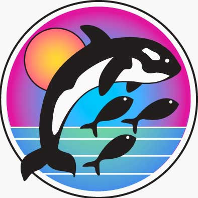
If you've spent any time on our site or opened our software, you've probably noticed the orca — leaping through a burst of color, with a few small fish swimming alongside. It's not just decoration. Every piece of it means something.
The logo was designed by a friend from church — someone rare enough to hold deep theology and creative brilliance in the same conversation. Before she ever sketched a line, she spent time with our founder just talking: about color, about faith, about what he loved. One of those conversations wandered into Star Trek IV: The Voyage Home — the one where humpback whales are brought forward in time to save Earth from an alien probe that only knows how to talk to whales. That story stuck, and it became the seed of the logo.
The whale was never meant to be a scientifically accurate orca — it grew out of that conversation, and it's stayed with us as a bit of an inside joke ever since. We sometimes tease, in a friendly way, that a few of our customers are a little more “killer whale” than others.

Symbolism & Meaning

Big Fish
The Big Fish (Orca) represents our customer — visible, out front, doing the public-facing work of serving the people who depend on them. services.
Sun
The Sun represents God — a reminder that this whole endeavor belongs to Him, and that He's the one who makes it possible.
Little Fish
The Little Fish represent are us. We swim alongside, mostly behind the scenes, occasionally visible at a conference or a support call, helping our customers get where they're going. We exist to play a supporting role for people who help others.
Color Palette
The color — bold, bright, unapologetically vivid — is simply our founder. He loves color the way some people love quiet and understatement. It shows up in the logo the same way it shows up in the office.